
While I liked that last Alien Savvy cover, I realized that I could do better.
I think I like this one better.
While I liked that last Alien Savvy cover, I realized that I could do better.
I think I like this one better.
Filed under writer promo stuff
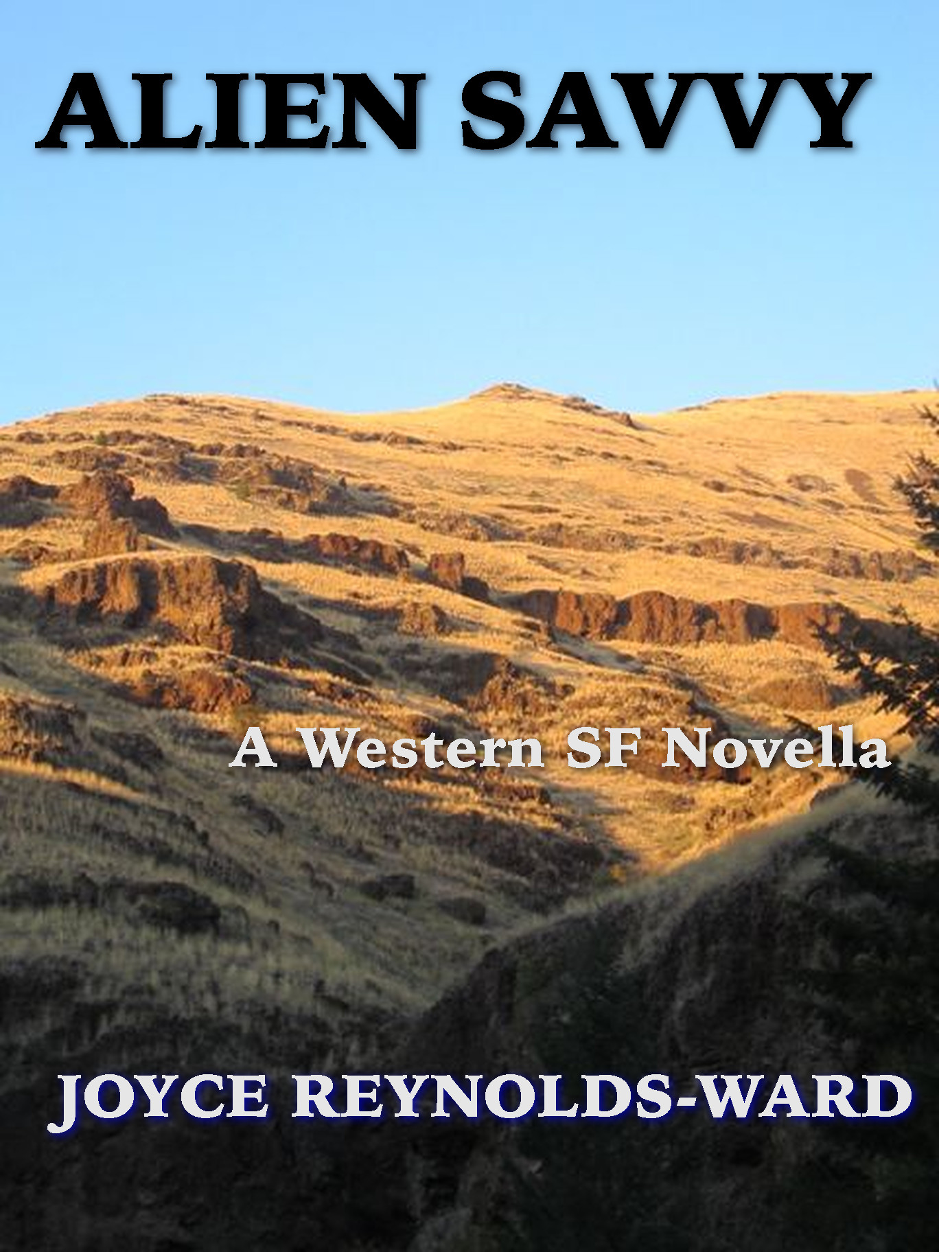
This one is better than the first.
A graphic designer’s tip – perhaps the single thing a person can do to make their piece look polished is to be aware of the margins, especially around text, and make them consistent. Side to side and top to bottom, where applicable. Side to side is easier to figure out generally, unless you are toying with justification (which should be done carefully), but top to bottom often confuses people. The margins on the top of “Alien Savvy” should be the same as the margin on the bottom of “Joyce Reynolds-Ward” and they should all be the same from side to side.
Increasing the bottom margin can sometimes add a feeling of anchoring something, but again it’s an individual thing that may or may not work with font choices, picture choices, font sizes and colors, etc. But even if you increase the font on the bottom of the bottom most text to give it a feeling of being weighted, it’s still pretty imperative to keep the other margins consistent. It will make it look more polished.
>>But even if you increase the font on the bottom of the bottom most text to give it a feeling of being weighted, it’s still pretty imperative to keep the other margins consistent.<<
It's probably good to proof read your comment before pressing enter, too. Sorry about that.
More clearly:
Try making the top margin above Alien Savvy the same as the sides, which should also be even. Then make the sides and bottom margin of the author name the same size as the margins of Alien Savvy. Either center "A Western SF Novel" (sub-title) or justify it to your preferred side so that it's consistent with the other margins on that side. Consider placing the subtitle the same margin width distance either below the title or above the author name. There is room for fluidity here but you'll see what I'm talking about with consistent margins. You will also notice the 'weighting' effect if you increase the margin on the bottom of the author name, especially if all the other margins are the same.
Things to play with.
Thanks. Will keep this in mind.